Description
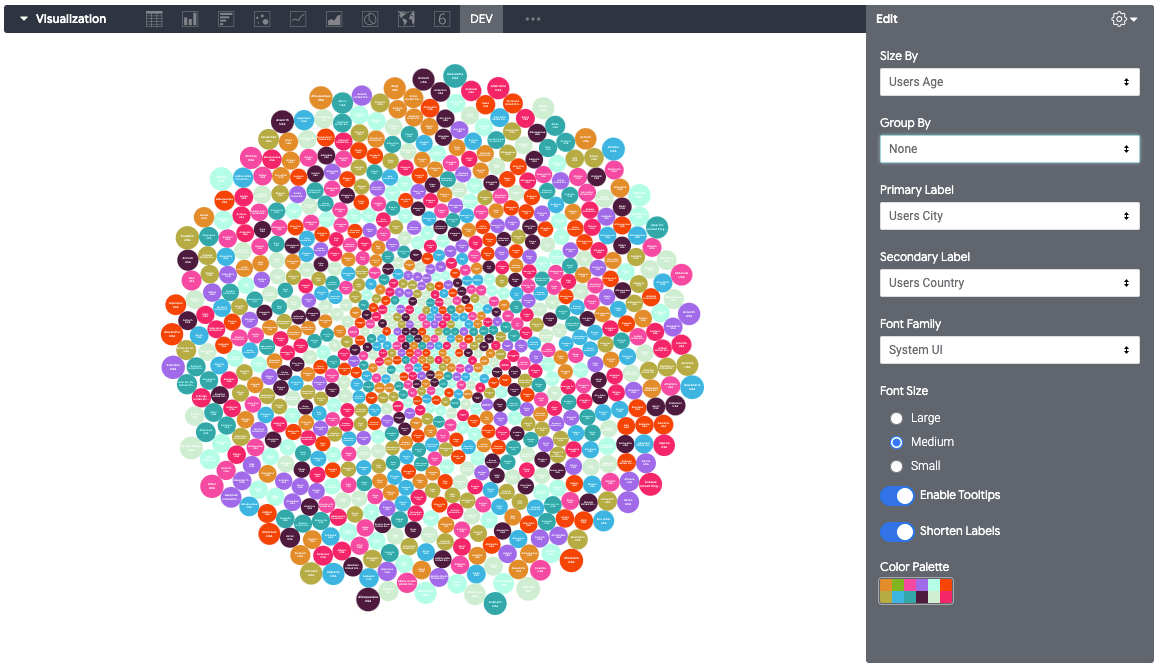
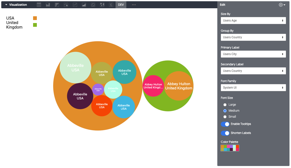
Bubble Chart by Akvelon provides efficient way to visualize your data that has one numeric dimension and one or two categories. This chart is simplified version of Scatter chart with tightly packed bubbles — this way you can show more categories in a given space. Additionally, Bubble chart allows to create groups of bubbles by providing additional second category field.
Visual capabilities
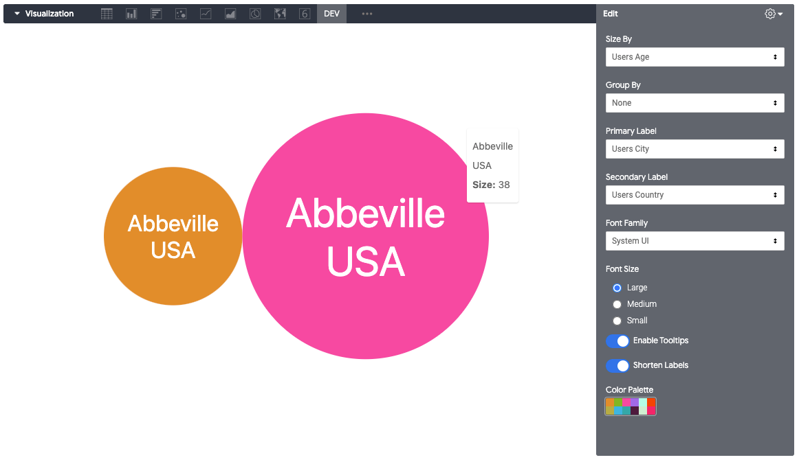
There are lots of formatting options to change look and feel and behavior of the visual. You can set a color palette for the scene, change grouping settings, apply font settings to the category labels of bubbles if you decide to show them.